Brand Identity & Visual DirectionBisous - Fictional Lip Gloss Brand
Role: Brand Identity · Visual Direction · Content Concepts
Type: Self-Initiated Project

“Drip. Gloss. Repeat.”

Instagram - Content & Visual Exploration

Logo
The logo was designed to feel fluid, bold, and playful, reflecting the glossy texture and expressive personality of the brand.
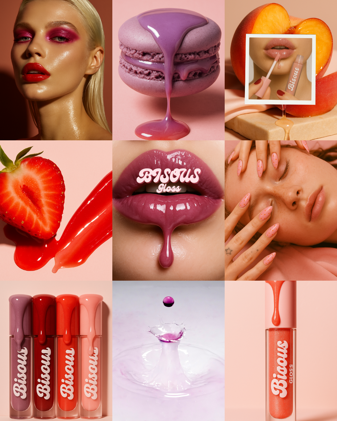
Exploring how the Bisous identity translates into social content through texture-led visuals, product storytelling, and a cohesive grid.
Concept Summary :
Bisous is a playful, flavor-forward lip gloss brand designed for modern beauty lovers who want their gloss to feel as good as it looks. The concept centers around sensorial pleasure, shine, texture, color, and taste, translating indulgence into a bold yet approachable brand identity.
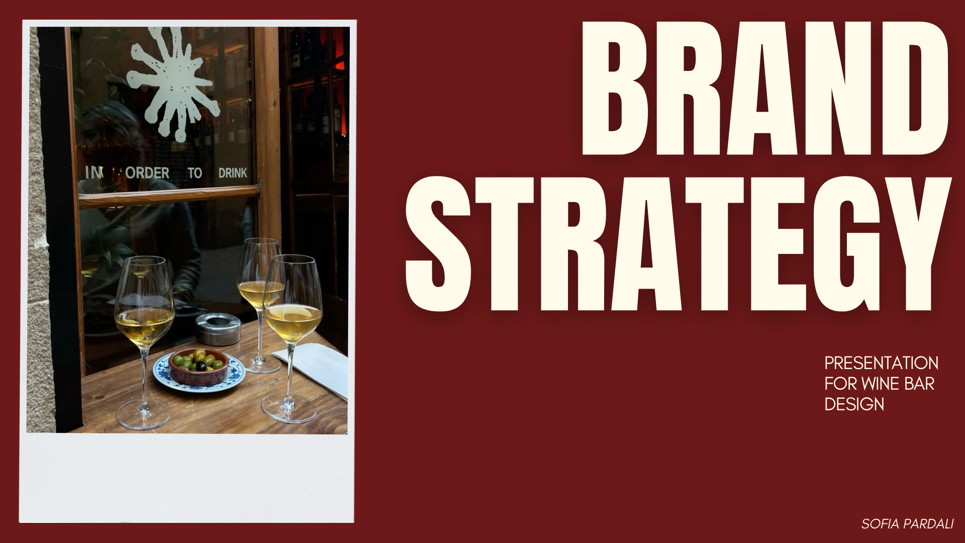
Beaujolaine - wine bar design
Role: Brand Identity · Visual Direction · Content Concepts
Type: Self-Initiated Project
This project is a fictional branding exercise developed to explore how strategy, tone, and visual identity come together to shape a cohesive brand experience.
Through the creation of Beaujolaine, a neighborhood wine bar concept, I focus on building a brand from the inside out, starting with intent, atmosphere, and audience, and translating those elements into a clear and consistent identity.
The project showcases my approach to brand thinking: grounding creative decisions in strategy, storytelling, and emotional clarity.
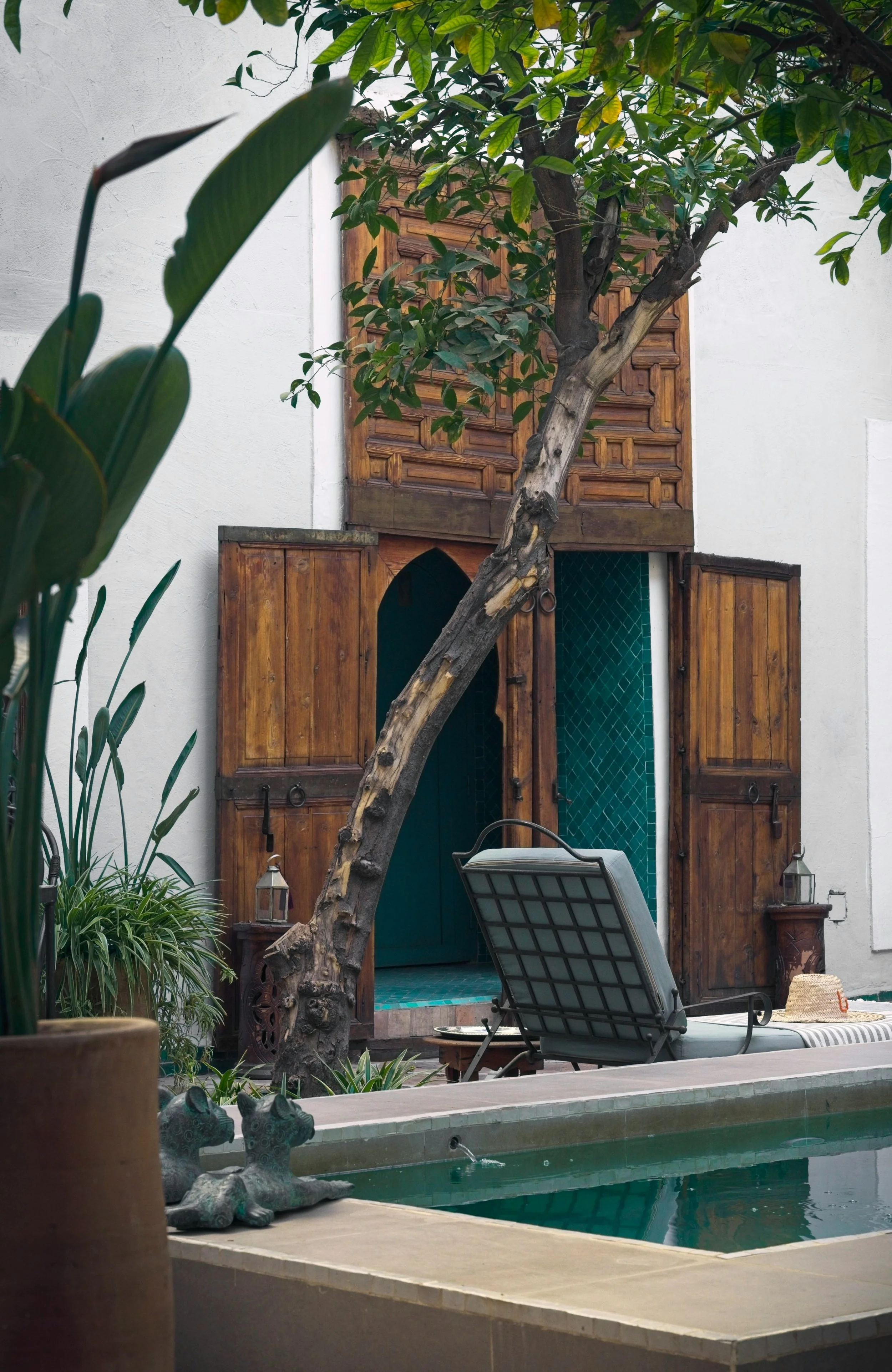
The brand
Brand Values
Warmth
Human, familiar, inviting
Ritual
Slow evenings, returned visits, shared moments
Visual Inspiration
Simplicity
Nothing excessive, everything intentional
Character
Imperfect, Lived-in, quietly confident
Beaujolaine aims to redefine the neighborhood wine bar as a space for slow evenings, effortless conversation, and sensory connection.
The brand focuses on creating an atmosphere that invites people to pause. Where wine becomes a social ritual rather than a performance, and where warmth, intimacy, and character are felt the moment you step inside.
Beaujolaine is a wine bar rooted in intimacy, ritual, and quiet confidence.
It is not designed to impress loudly, but to feel familiar, inviting, and lived-in.
The brand draws inspiration from European wine culture , where wine is less about expertise and more about presence. It values warmth over spectacle, depth over trend, and atmosphere over excess.
At its core, Beaujolaine is about creating a place people return to.
A bar that becomes part of an evening routine, a meeting point, a small ritual woven into everyday life.
Core Audience
Urban adults, 25–40
Interested in wine, culture, and atmosphere
Appreciates books, vinyl, and quiet social spaces
Values conversation, ritual, and familiarity
Prefers slow evenings over nightlife spectacle
Wine as a reason to gather, not to perform
The objective
Target Audience
Atmosphere first, everything else follows
Lifestyle & Mindset
Chooses neighborhood places over trends
Seeks warmth, not performance
Returns for feeling, not novelty
Not For
Loud, party-driven nightlife
Wine prestige and connoisseur culture
Trend-chasing “hot spots”

Brand messaging & Tone of Voice
A place you return to, not just discover
Evenings that unfold slowly
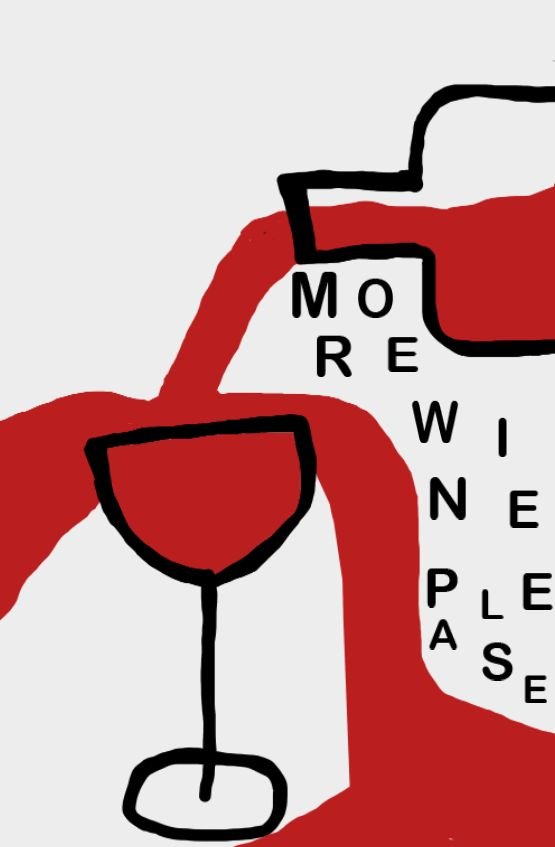
“When life gives you oranges, add sangria”
“Born to be Boujee-lais”
“Houston, we need wine”
“Wine not now?”
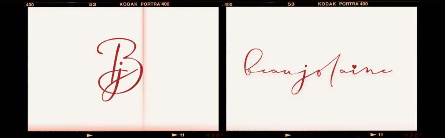
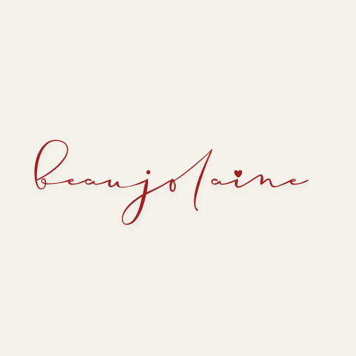
Logo
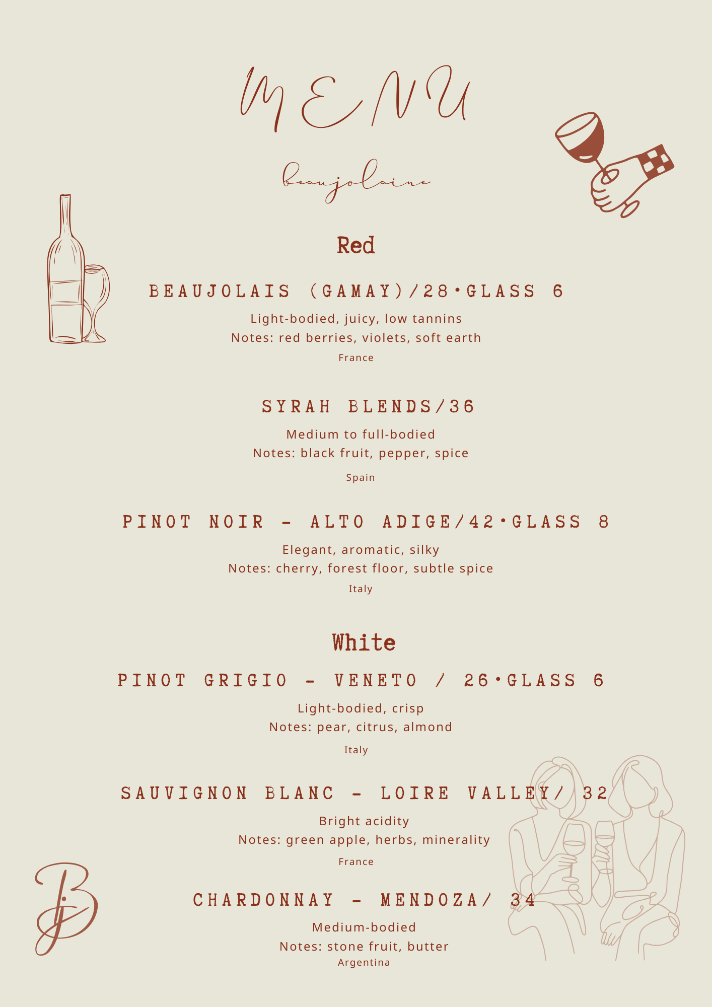
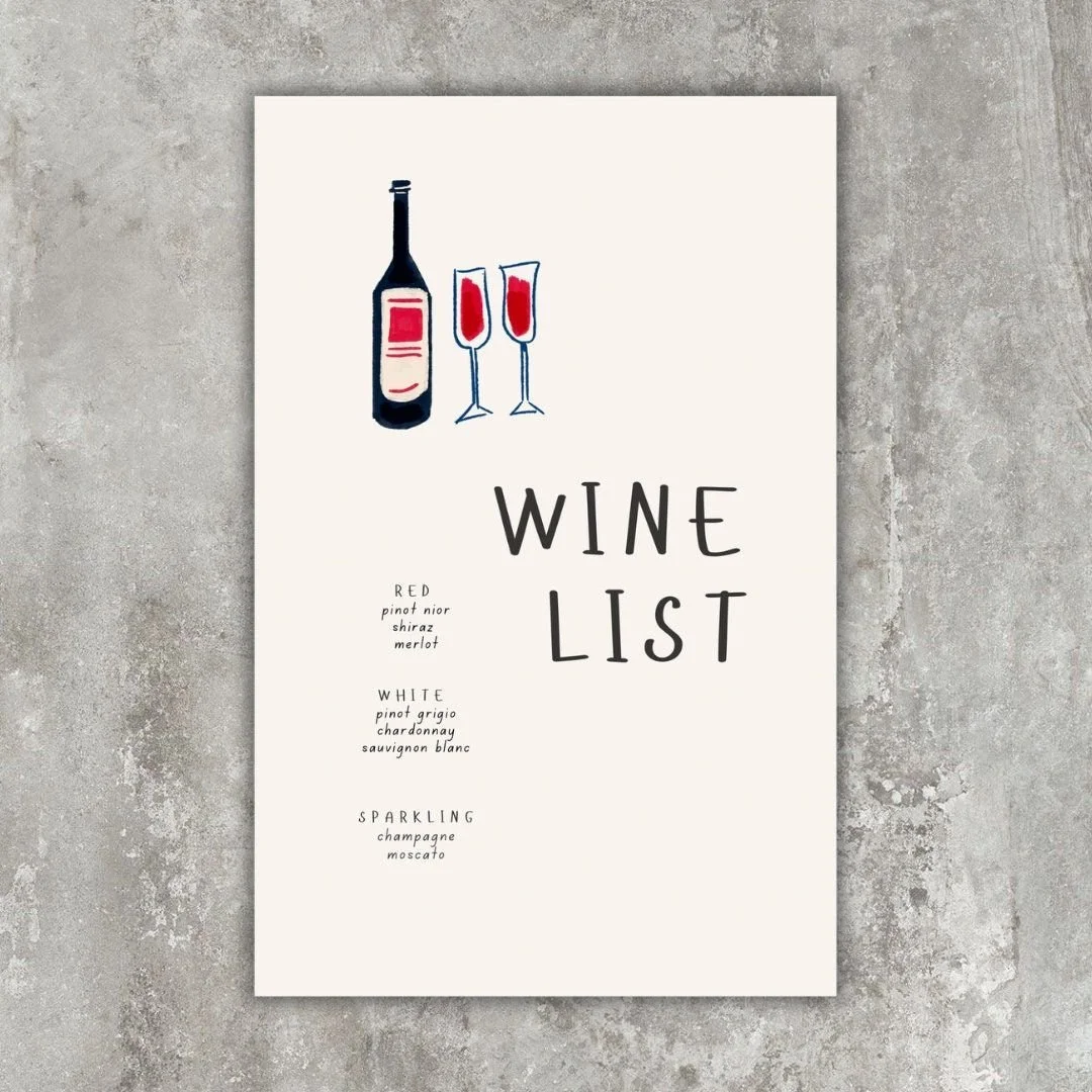
Menu Design
Menu concept focusing on clarity, typographic hierarchy, and tone of voice—balancing approachable wine descriptions with a warm, understated visual system.
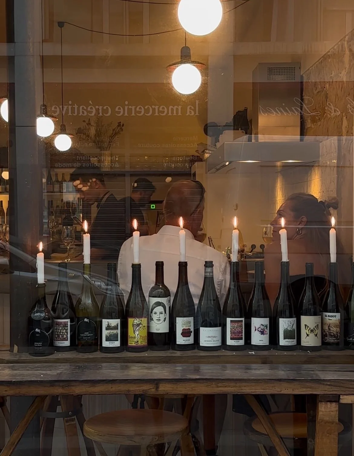
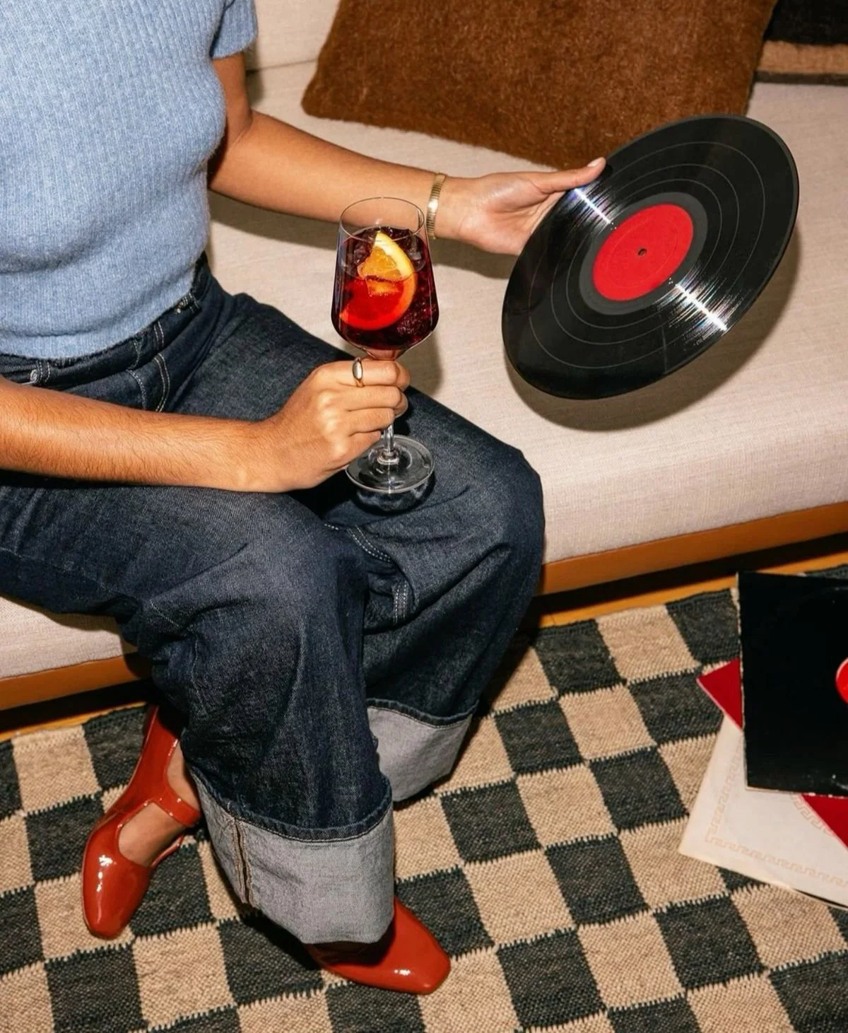
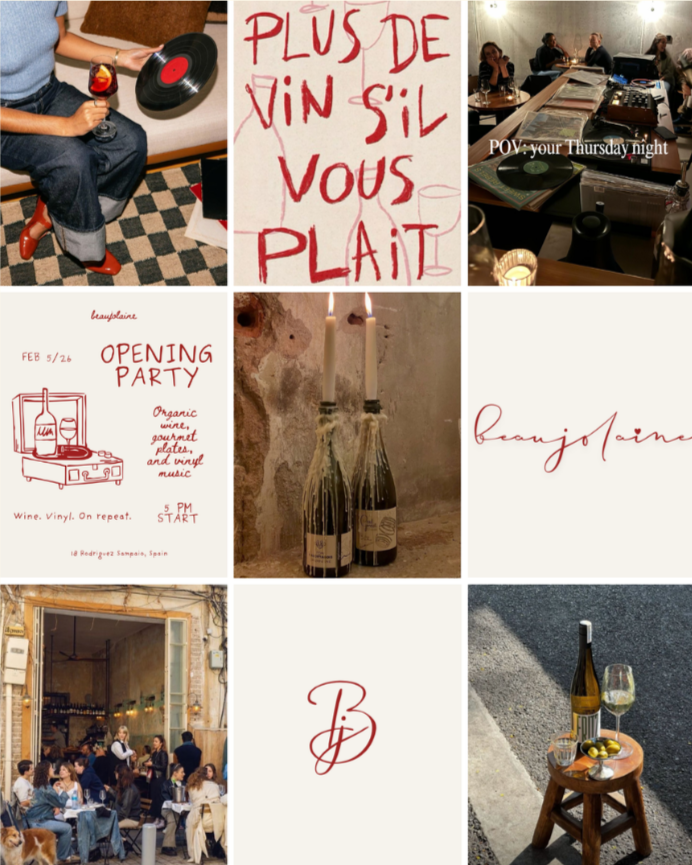
Social media Content
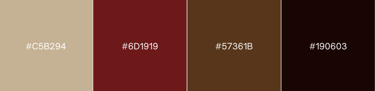
Colour Palette
A warm, wine-inspired palette that reflects candlelit evenings, aged wood, deep reds, and quiet intimacy.
Primary logotype inspired by handwritten wine labels and personal notes: intimate, imperfect, and expressive.
The script style reinforces the brand’s human, unpretentious character while subtly referencing classic French wine culture.
The monogram version (“B/J”) is designed for stamps, bottle tags, glassware, social icons, and small-scale applications.
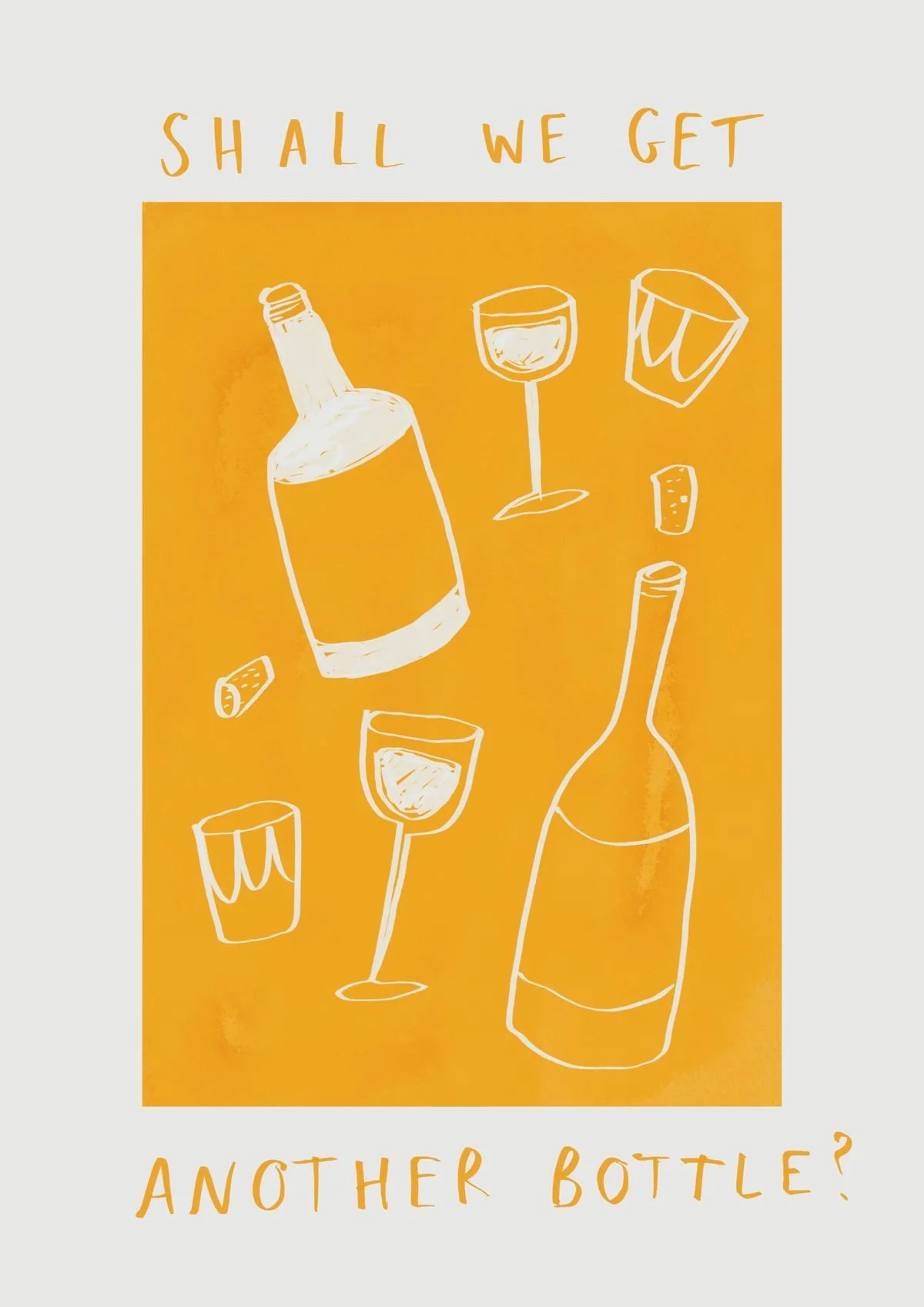
Menu & Opening poster design
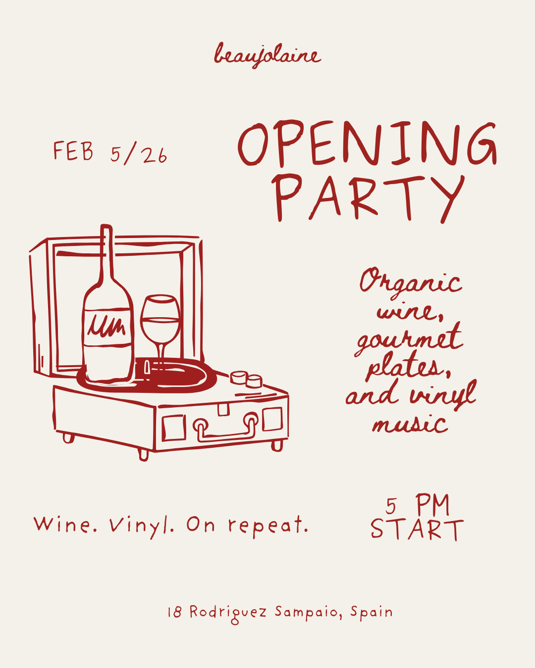
Opening Poster
Brand application exploring tone of voice, illustration, and visual hierarchy for a wine bar opening night. Designed to feel intimate, informal, and culturally rooted.
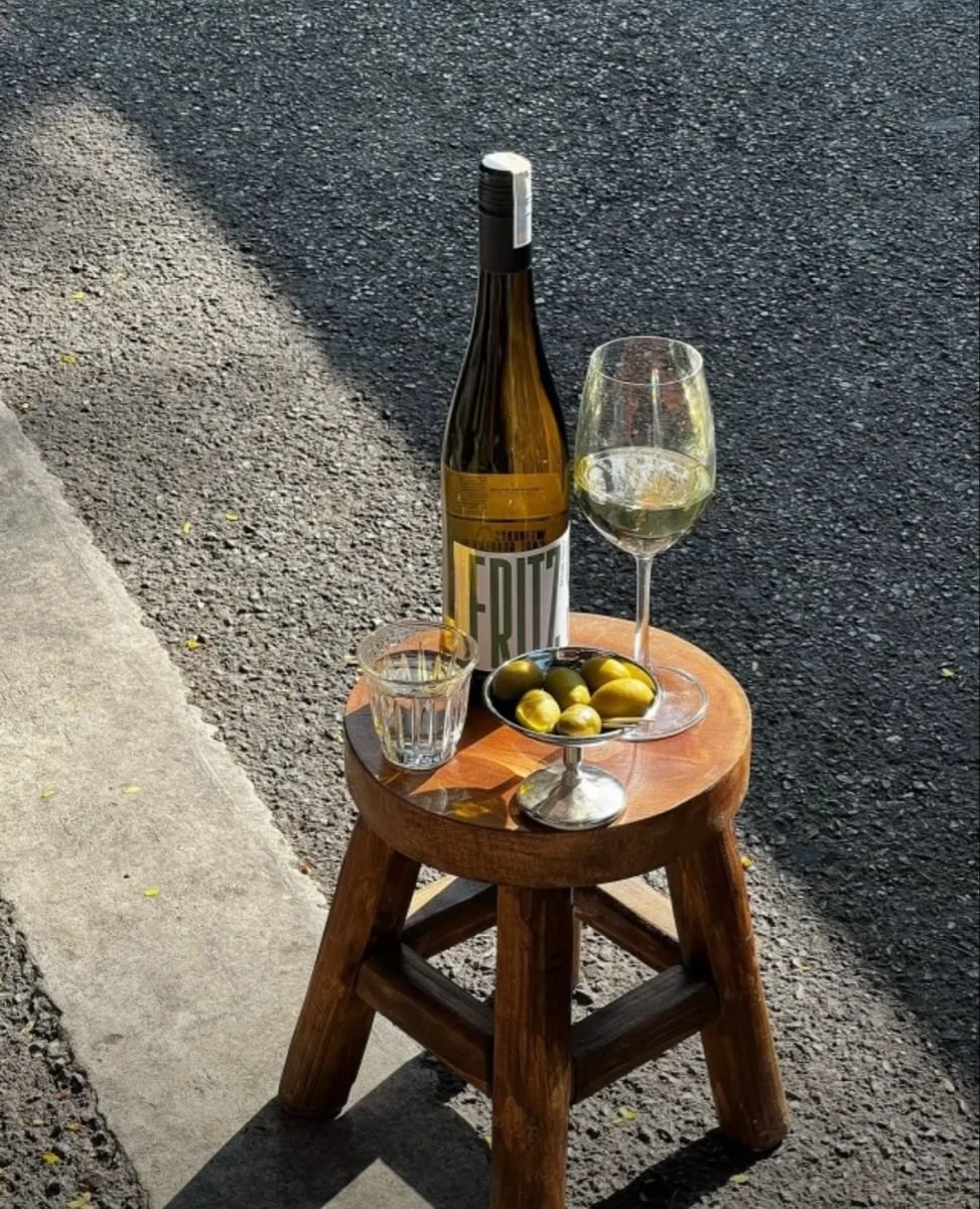
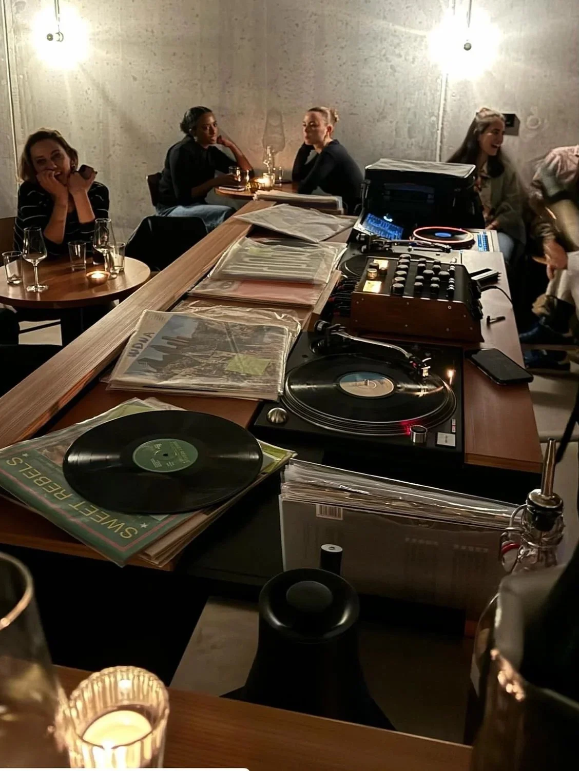
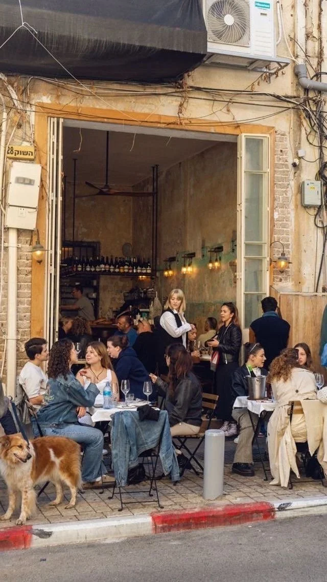
Social content designed as an extension of the physical space, capturing atmosphere, rituals, and small moments rather than polished campaigns.
A mix of typography-led posts and candid photography builds a feed that feels intimate, lived-in, and true to the brand.
Content focuses on atmosphere, rituals, and shared moments rather than promotions, mirroring the experience of being inside Beaujolaine.
The feed balances typography-led messages, product details, and candid social scenes, creating a warm, lived-in presence that feels inviting and unforced.
Select Works
A selection of brand and content-focused projects exploring storytelling, visuals, and digital presence.
Brand Content & Social Presence